Symbiant: Smart Homes That Feel as Simple as Your Phone

The paradox of the modern luxury apartment
Premium residential buildings have spent the last decade stacking on capability: multi-zone audio, motorized window treatments, tunable architectural lighting, integrated entertainment walls, climate control down to the room. Each system on its own is a small luxury. Together, without the right interface, they can turn into a wall of unlabeled keypads and a stack of remotes nobody wants to learn.
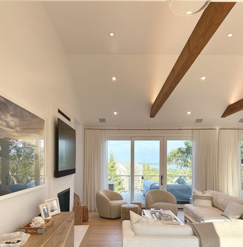
Symbiant starts from a simple premise: the technology in a home should disappear into the experience of living in it. You shouldn't need a manual to dim the dining room, cue up a playlist in the bathroom, or find out which switch actually controls the hallway lights.

A floor plan, not a flowchart
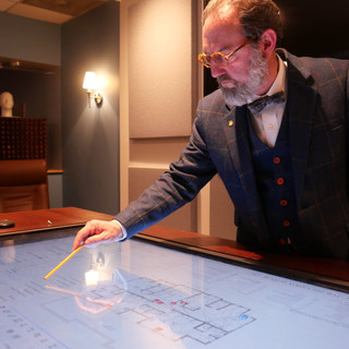
The centerpiece of the Symbiant experience is something deceptively simple: a real, to-scale floor plan of your home, right there on the touch panel or tablet. Instead of guessing which of a dozen identical buttons controls the guest bedroom, you tap the guest bedroom. Instead of memorizing zone numbers for the audio system, you tap the room you're standing in.
It's the same instinct behind why a map is easier to use than a list of coordinates: people think spatially about their own homes. Symbiant's interface mirrors the actual architecture (foyer, media room, master suite, dining room) so navigating your home's systems feels exactly like navigating your home.

Familiar, by design
Symbiant's interface borrows deliberately from the visual language people already use dozens of times a day on their phones: a clean grid of rounded icons, generous white space, a restrained and consistent color palette, and typography that prioritizes legibility over decoration. Nothing about it needs to be taught.
That familiarity is the point. A resident who has never seen a Symbiant panel before can walk up to it and immediately understand what they're looking at, because the visual grammar (icons, color-coding, simple taps instead of nested menus) is the same grammar their phone has already trained them to read. Sophisticated automation doesn't need to feel foreign to feel powerful.

One tap, every layer
Behind that simple floor plan sits real complexity, handled invisibly. A single "evening" scene can lower the shades, bring the lighting to a warm, layered glow (cove lighting up, recessed downlights dimmed, a pendant fixture set just so), and start music playing softly through the room's speakers, all from one tap. Want to watch a film instead? Another tap dims the room, drops the shades, and brings the entertainment wall to life, television and sound system already synced.
None of this requires the resident to think about which system is doing what. Lighting, shades, audio, and video are treated as one connected environment rather than four separate technologies competing for attention, because from where you're sitting, they should feel like one thing: the room, working the way you want it to.

Built for how people actually live
This kind of integration matters most in the homes where the stakes for daily usability are highest: a primary residence, not a device someone tolerates. A quiet evening should call up music without a search. A guest staying in the spare bedroom should be able to adjust the light in their room without paging through someone else's saved scenes. A homeowner should be able to find "guest bedroom" on a map, not "Zone 7."

As more premium apartments add another lighting scene, another shade motor, another audio zone, the risk isn't too little technology. It's too much friction in using it well. Symbiant's bet is that the winning smart home isn't the one with the most features. It's the one where you forget the technology is even there, because using it feels as natural as picking up your phone.
That's a home that works the way city living should: effortlessly. That's the problem Symbiant was built to solve. https://www.bri-tech.com/home-automation